
Website navigation best practices have changed throughout the years, especially now that more visitors are using mobile devices by a large percentage. In my recent experience, which includes assessing over 200 websites for tourism-related businesses, I’ve found that most businesses have overcrowded navigation that doesn’t give visitors a clear path to making a sale, booking, etc. When a visitor becomes frustrated with your website or has trouble finding the desired content, you risk losing the opportunity to turn the visitor into a customer.
Website Navigation Best Practices
Before developing, or redeveloping, your website, work with your web development team to determine the ideal structure of your website. Consider the following to create a flowchart or map for the website’s structure and navigation:
- The topics of information that will be included on the website and what sub-topics may also be included.
- The hierarchy of the content on the site. The higher priority content is usually the content about your offerings and how to purchase. Supporting content is usually a lower priority.
- What stage of the “Buyer’s Journey” the content is relevant to: Awareness, Consideration, Decision, and Post-Purchase.
- Determine clear “Paths to Conversion” that a visitor will need to follow to take the actions you desire, whether making a purchase, booking, signing up for your mailing list, etc. When doing this, consider that visitors will enter the site at different points, not just on your homepage.
- The language that is most relevant and engaging to your audience to be used in creating the text to be used in the navigation (“anchor text”). This may be found through your target market research and your day-to-day dealings with prospects and clients.
- Commonly accepted navigation styles, in general, and for your industry.
Common Errors with Website Navigation
- Including all topics on the main navigation.
- The fix: Include only the priority content on the website’s primary navigation, the main menu. Create secondary navigation for the lesser priority, supporting content. Secondary navigation may be located above the header, in a bar at the side (“sidebar”), or at the bottom of the site (“footer”).
- Including all content in the main navigation is also an issue for SEO. When a search engine crawls your site, it will see all the content as equal in importance and not rank it appropriately. You want search engines to give your priority content a higher value rather than see it all at an equal value that is likely to be lower.
- The items on the navigation bar are not in order of priority.
- The fix: Most visitors will look at your navigation bar, or another type of menu, from right to left or top to bottom. Make sure that items on the menu are arranged in order of priority when viewed this way.
- Cool, but unclear Menu Styles, aka The Designer’s Gone Crazy!
- The fix: While innovation and creativity are often a plus in design, a navigation structure entirely different from best practices may confuse users. If you want to stray from commonly used structure or design, make sure that your audience will be able to follow easily.
- The text used in the navigation is not clear.
- The fix: The text used in navigation should be clear to users and give them a “scent” of where they need to go to get the desired information. Information Scent is an essential concept for effective website navigation and structure. If done well, users can more easily find and navigate to the content they are looking for and along the path to becoming a customer.
- As an old-school SEO, I still like to use my main keyphrase as the “anchor text,” but only if it is clear to users where the link leads.
- There are elements in or near the navigation that may distract the user.
- The fix: Remove distracting elements like social media icons with links and site search boxes.
- Not ensuring that navigation on mobile devices also follows these best practices.
- The fix: Work with your web development team to ensure that the primary and secondary navigation viewed on mobile devices is accurate and easy to follow. It may not mirror the navigation used for desktop devices because of limited space, etc., but your priority content must be easy to locate and navigate to.
If you need assistance reviewing your website’s navigation,
click here to schedule an initial consultation.
Here are two examples from websites that appear on the first page of searches for “places to stay in London.”
Booking.com – an example of website navigation that will maximize sales
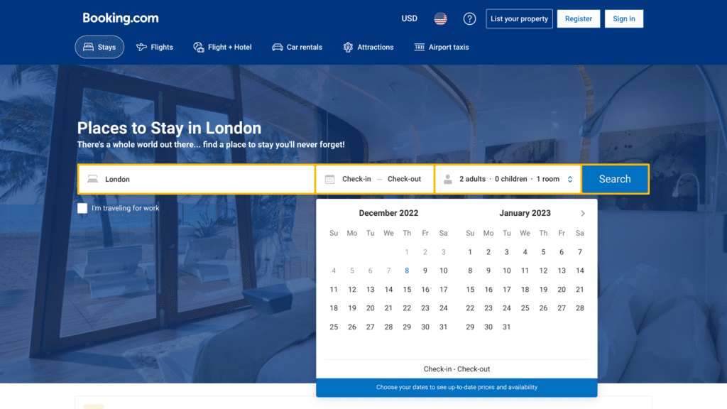
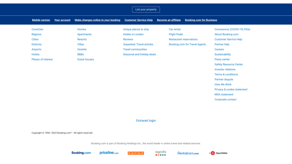
While most visitors to Booking.com are regular visitors and will use the search feature below the navigation, Booking.com still ensures that only their priority content is located on the main menu. Their main menu serves a second purpose in showing users they can also book attractions, taxis, etc. These are organized in what is likely to be priority order left to right. There is secondary navigation at the very top of the page for users to change preferences for language and currency, register or log in to access their specific information. There is extensive secondary navigation at the bottom of the page for the lower priority content, as well as alternative ways to access their listings:
MissTourism.com – an example of website navigation that will cost you sales
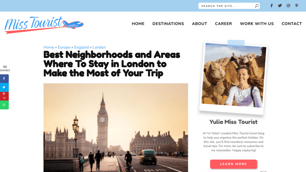
There are some critical issues with the navigation of MissTourist.com:
- All content topics are included in the main navigation and does not appear to be arranged left to right by priority.
- Some elements near the navigation may distract the user from moving along the desired path: social media icons and a search box.
- The text used for the menu items is unclear, i.e., Career vs. Work with Us.
I assume that the main objective of MissTourist is to get users to the blog posts as they have affiliate links, likely to be the primary revenue source of the website. My suggestions to maximize these clicks:
- Include only the continents on the main menu with dropdowns including the countries in each continent she wants to feature.
- Arrange the continents left to right by priority or alphabetically if this would suit your target market better.
- Move the other links, including social media icons, to secondary navigation either above the main navigation or at the bottom of the site.
- Change the wording of the menu items to ensure clarity for users.
Are you making mistakes that can cost you sales?
- Review the navigation of your website, desktop and mobile versions, against the list of best practices noted above.
- Look at your website analytics for indications of poorly structured navigation:
- High Bounce Rate
- Navigation Path shows visitors not following your desired conversion path to sales, bookings, etc.
- High Exit Rates on pages that should lead to conversions
- Phone calls or emails from those that had been on the site but didn’t find desired information that is present on the site.
If you need assistance reviewing your website’s navigation,
click here to schedule an initial consultation.